The success of your online store depends not only on the number of users you lead to your store through smart marketing, much more important is the conversion rate.
We took a detailed look at the Shopware 6 checkout process and left no stone unturned: Find out here our best practices on how you can increase your sales with simple means without having to tap into additional traffic sources.
Shopware has done a lot of things right with version 6, but the A/B tests that we have conducted together with a large number of our customers show some weaknesses. We have collected them here and hope to help you to raise the conversion of your online store to the next level. We have written a few plugins to eliminate the problems, which we also draw your attention to here.
First of all, an important thought: The design of your online store should always be based on your target group and meet their needs. We have limited ourselves in our explanations as far as possible to generally valid tips, which you should nevertheless question and see if it also fits your target group.
1. Reduce the complexity of the checkout process
One of the most important issues is to keep the complexity of the checkout process as low as possible. Although it depends on your target group, you should consider the following questions:
Do I only ask for the most necessary information to process the order?
If you look at the checkout process of AMAZON, for example, you know what is meant by this; once registered with AMAZON, you can complete any order that follows with one or two clicks. Super simple and super fast. If you do the checkout for the first time, the form is limited to the essentials and filled out comparatively quickly. This is how it should work, because this is also where the most potential lies, almost 20% of your users do not complete the checkout to the end, because they have to enter too much or unnecessary data.
One-page or multi-page checkout?
How many steps do I take my users through during checkout: one-page checkout or multi-page checkout?
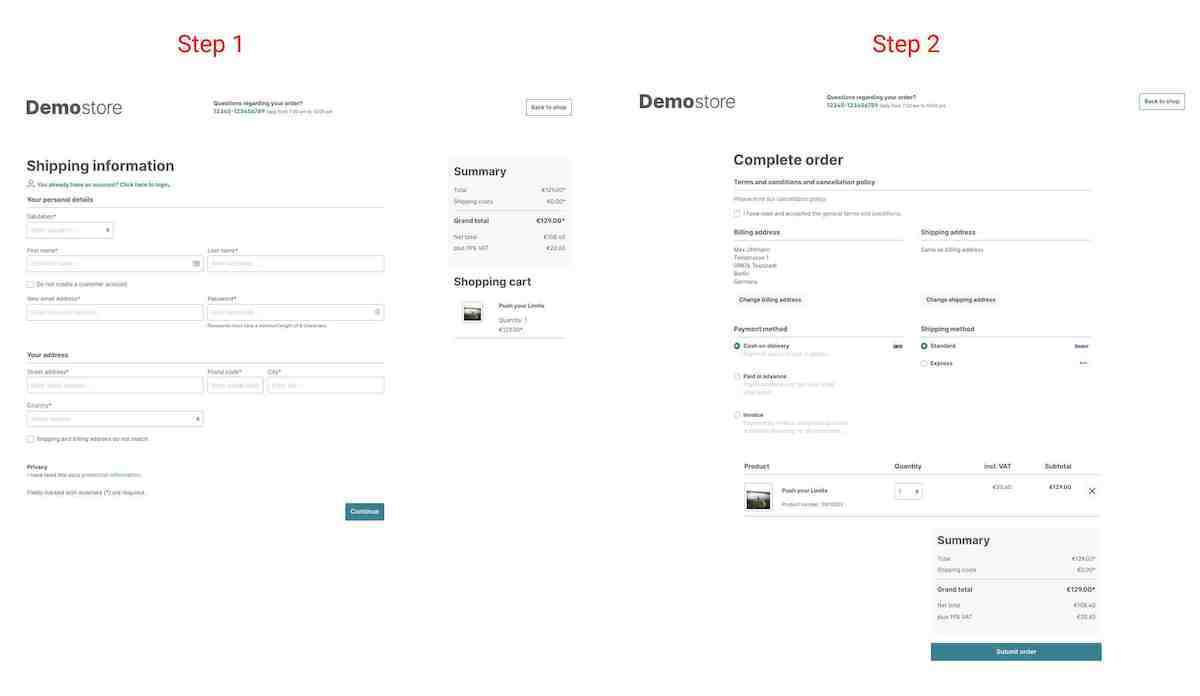
Long standard with Shopware but no longer available in version 6: The one-page checkout. More and more tests show that the classic multi-page checkout is getting on in years and the one-pager is becoming more popular and successful. Like so many things in life, however, both variants have their advantages and disadvantages:
The One-Page-Checkout

Pros
- Faster checkout is possible: all required information is requested on a single page
- Easy to understand: A single, well-structured page makes the process easier for users to follow and information can be adjusted again on the spot without jumping back and forth
- Reduces abandonment rate: Overly convoluted checkouts with poor design are the number one reason for abandoned carts.
Cons
- Slower loading time: This fact should not be underestimated, especially on mobile devices: The more content you display on a page, the higher the loading time of the page
- Unfamiliar: For many users, a multi-page checkout is simply part of the process: First the entry of personal data, then the payment details, and in the last step a check of this information
The Multi-Page-Checkout

Pros
- Users feel more secure: Filling in all the necessary information step by step gives users confidence when making a purchase, especially when buying something expensive
- Clean layout: The information is spread over several pages, so each page is less cluttered and contains only the most necessary information
Cons
- Long checkout process: By splitting the checkout process over multiple pages, the checkout process takes longer and users may lose patience and prefer to go to another online store with a more streamlined process
- Difficulty correcting entries: By splitting the checkout process into multiple pages, users have a harder time correcting their entries and may abandon the purchase prematurely for this reason
Conclusion
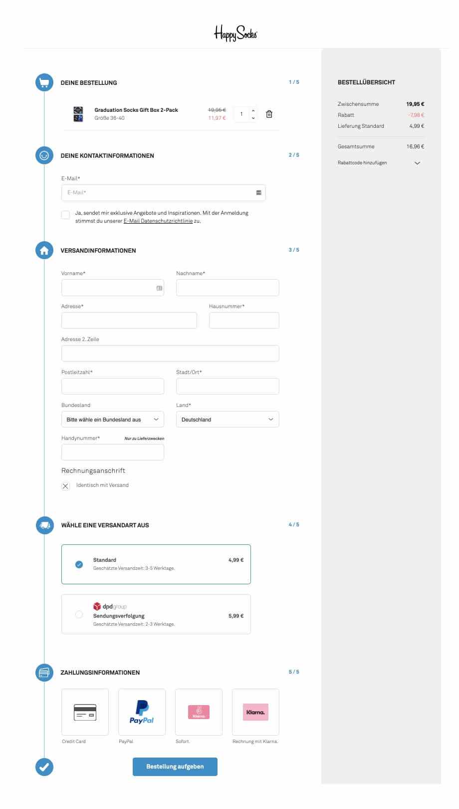
Our recommendation is to use a one-page checkout. The disadvantages mentioned above can be limited by using a very clean and reduced design - similar to Happysocks. Data underlines this development, stores with one-pagers have up to 20% higher conversion rates than stores with multi-page checkouts.
We find the following comparison quite good: How do you behave in an offline store? You don't look for the checkout where the most people are waiting, but you go to the checkout where you can check out as quickly as possible. We should think the same way online :)
2. User accounts and problems with them
The second most important factor for optimizing the checkout in Shopware is the handling of user accounts. Can users who have already created an account log into their account during checkout without any problems? Is it possible to order without creating an account?
Guest orders
We must not assume that we are AMAZON, customers who visit our online store may not want to permanently disclose your private data to the hundredth store. Today, you should definitely create the possibility that users can easily use all the features of the store even as a guest.
In Shopware version 6 it is fortunately standard, users do not necessarily have to create a user account and can also check out as a guest. Check this out, this is one of the biggest levers to increase the conversion of your store.
Social Logins
Many users consolidate their logins by using their existing social media profiles and logging in to all possible online services with them. Of course, this is not so easy for an online store, but through a plugin for Shopware 6 and a clever process, address data of users who use, for example, the Facebook login can be used for the order.
Login-Issues
During our tests, we noticed that there are numerous problems, especially for users who already have an account.
Through analysis with the help of Hotjar, we have discovered that Shopware 6 is somewhat flawed: as soon as a user requests a new password in the checkout process and is then taken back to the checkout via the link from the password reset email, the shopping cart is empty. This frustrates not only users, but certainly you as a store owner: Almost 50% of users have not purchased the item afterwards.
To solve the problem, we have developed the following plugin for our customers, which we now also offer for sale here:
Remember Basket
This plugin restores the cart if a user has forgotten his password during the checkout process and requests a new password. This feature increases the conversion significantly.
We have also observed that users often no longer know their password and are then reluctant to request a new password. This leads to dissatisfaction and ultimately to purchase cancellations, as it is then easier to order from AMAZON with an existing account. A very elegant way to make this process more pleasant for the user is a Magic-Login-Link, with whose help the user can log in. He only has to enter his email address, receives a link and is logged in to his account. This game-changing approach leads to more customer satisfaction and purchase transactions. The leverage is greater than one might initially think.
That's why we also did some research and since there is nothing comparable on the market, we created the following plugin:
Login without password, quick login with Login Link
Using this plugin will allow your users to log in with a login link. Users just need to enter their email address and after a few seconds they will receive a link via email to log in.
3. Increase the trust in your online store
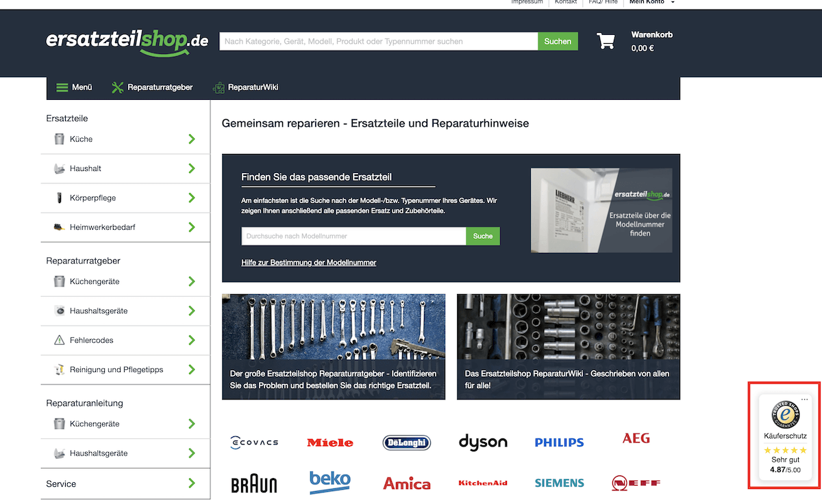
Especially if your store is still very unknown, you should make sure that users trust your store. Regardless of your store system, you should look at providers such as Trusted Shops, Trustpilot or Google My Business.
Unlike in the 2000s, today it's less about whether you're being "ripped off" online - customer trust is now very high - and much more about whether you can keep the delivery promise you made and the quality of the goods. At the latest since the success of AMAZON, customer feedback has become standard and is simply part of the purchase decision.
You have several options to include a review badge in your website, which always provides security and confidence in the purchase.

But which provider should you choose?
Trusted Shops
Classic providers such as Trusted Shops offer you an administration of your store reviews and an insurance of the purchase after completion of the purchase. Trusted Shops is comparatively expensive and the fee increases with your turnover. For example, you pay for 1.5 million euros annual turnover, a contribution of almost 3,600 € per year. That is a proud price.
Trusted Shops takes over the entire process of obtaining reviews: After successful completion of the purchase, a follow-up email is sent at intervals of several days with a request for a review. The provider collects these reviews as an independent entity and makes them available online for users. Another service is the protection of the purchase for the customer: If you do not deliver the goods to your customer as agreed, Trusted Shops steps in and compensates him.
Trustpilot
The free alternative to Trusted Shops, but without the protection of the purchase. This provider does not directly take care of sending the rating emails, the corresponding link must be manually integrated into an email by you.
Google My Business
Also a free alternative. Google's own review platform has a big advantage: The reviews are displayed directly in Google's search results and thus always ensure a (hopefully) positive image of your brand.
Is the investment in Trusted Shops worth it?
One of our major customers was brave and joined us in putting Trusted Shops to the test. We first removed all references to the purchase insurance offered by Trusted Shops for 50% of all users. However, the badge on the website, which shows the average ratings, remained. Now the surprise: we noticed no change in conversion at all! This surprised us and made us curious: Is Trusted Shops really crucial for higher conversion? We removed the reference to securing the purchase completely (for 100% of the users) and showed the Trusted Shops badge for 50% and a Google My Business badge for the other 50% (for free!). In both test groups, the conversion was almost identical, we could not find any differences.
Therefore, it doesn't have to be an expensive solution: a solution like Google My Business is perfectly adequate.